Deviation Analysis for Analyzer Metrics
Overview
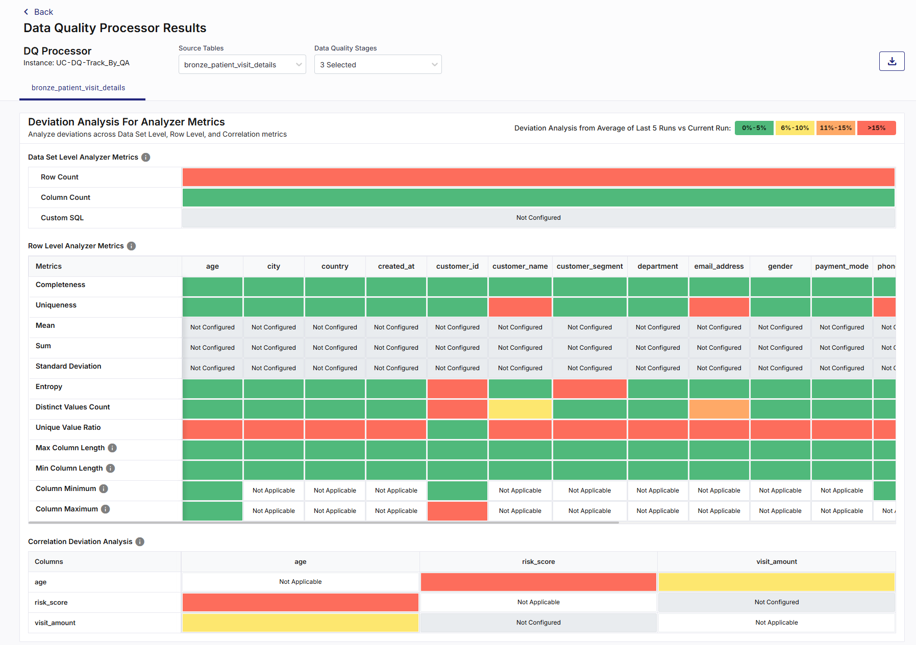
The Deviation Analysis for Analyzer Metrics widget shows how key analyzer metrics have changed in the current run when compared to the average of the last 5 runs. It helps users quickly identify unusual changes or unexpected behavior in dataset-level, row-level, and correlation-based metrics.
This widget is part of the Data Quality Processor Results dashboard and is used to monitor consistency and stability of data over time. It highlights deviations using clear color indicators so that users can easily spot metrics that may require investigation.
What the Widget Analyzes
Profiling dimension: Metric deviation over time
Level of analysis:
-
Dataset-level analyzer metrics
-
Row-level analyzer metrics (column-wise)
-
Correlation analyzer metrics (between selected numeric columns)
Calculation Basis
For each analyzer metric:
-
The widget compares the current run value with the average value of the last 5 runs.
-
The percentage deviation is calculated based on this comparison.
-
The deviation percentage is mapped to predefined deviation ranges and displayed using color indicators.
This comparison helps detect sudden spikes, drops, or instability in data behavior across runs.
What the Widget Shows
The widget is divided into three main sections:
-
Data Set Level Analyzer Metrics
-
Row Level Analyzer Metrics
-
Correlation Deviation Analysis
Across all sections, the widget displays:
-
Metric names
-
Column names (where applicable)
-
Color-coded deviation indicators
-
Status labels such as Not Configured and Not Applicable
A legend at the top-right explains the deviation ranges used for color coding.
Deviation Thresholds and Color Coding
Deviation values are grouped into the following fixed ranges:
|
Deviation Range |
Interpretation |
|---|---|
|
0% – 5% |
Very low deviation |
|
6% – 10% |
Low deviation |
|
11% – 15% |
Moderate deviation |
|
> 15% |
High deviation |
These colors allow users to quickly assess whether a metric is stable or shows abnormal variation compared to recent runs.
Metric Status
-
Not Configured - Indicates that the analyzer metric was not enabled or configured for the dataset or column.
-
Not Applicable - Indicates that the metric does not apply to the data type of the column (for example, numeric-only metrics on non-numeric columns).
These statuses are informational and do not indicate errors.
Data Set Level Analyzer Metrics
This section shows deviation results for metrics calculated at the dataset level.
Metrics include:
-
Row Count
-
Column Count
-
Custom SQL (if configured)
Each metric is displayed as a single row with a color-coded bar indicating the deviation of the current run from the last 5 runs average.
How to read this section
-
A green indicator suggests stable dataset behavior
-
Yellow or orange indicates noticeable variation
-
Red highlights significant deviation that may require attention
Row Level Analyzer Metrics
This section displays deviation analysis for metrics calculated at the column level.
Metrics include:
-
Completeness
-
Uniqueness
-
Mean
-
Sum
-
Standard Deviation
-
Entropy
-
Distinct Values Count
-
Unique Value Ratio
-
Maximum Column Length
-
Minimum Column Length
-
Column Minimum
-
Column Maximum
Each row represents a metric, and each column represents a dataset column. The intersection cell shows the deviation status using color coding.
How to read this section
-
Green cells indicate minimal deviation for that metric and column
-
Yellow or orange cells indicate moderate changes
-
Red cells indicate large deviations that may signal data drift or quality issues
-
Cells marked as Not Configured or Not Applicable indicate unavailable comparisons.
Correlation Deviation Analysis
This section shows deviation analysis for correlation metrics between selected numeric columns. It displays:
-
A matrix layout with column pairs
-
Color-coded cells indicating deviation levels
-
Diagonal cells marked as Not Applicable or Not Configured
This view helps users observe changes in correlation-related metrics across runs without exposing numerical details.
How to Read This Widget
-
Color intensity reflects the degree of deviation.
-
Consistent green patterns indicate stable data behavior.
-
Scattered or clustered red cells highlight areas needing investigation.
-
Comparing across metrics helps identify whether deviations are isolated or widespread.
-
Hovering over any colored cell displays a tooltip with the exact deviation percentage.
-
Clicking on supported cells or icons navigates to a detailed deviation view for that specific metric and column, allowing deeper comparison across runs.
-
Click the download icon to export the result as PDF, CSV, or XLSX file. You can either download a consolidated file or individual widgets.
-
Download individual widgets to analyze specific visualizations in detail and gain deeper insights. Files are saved using a standard naming format by default, which you can rename locally after download:
<Data Quality Stage name>_<Source Table name>.<pdf | csv | xlsx>
Example: DeviationAnalysisForAnalyzerMetrics_bankrecords.xlsx
-
For consolidated Excel downloads, each widget is exported to a separate worksheet. For example, three widgets are saved as three sheets within a single Excel file.
-

Note:
The widget interactions are for analysis only and do not modify the dataset or configuration.
Available Views
This widget supports a single, fixed view that combines:
-
Dataset-level metrics
-
Row-level metrics
-
Correlation metrics
Note:
All displayed information is read-only.
How to Interpret The Results
-
Low deviation across most metrics indicates stable and consistent data.
-
High deviation in row-level metrics point to changes in data population, structure, or values.
-
Dataset-level deviations may indicate ingestion or upstream data changes.
-
Repeated high deviations across runs may require further investigation or rule adjustments.
When to Use This Widget
-
To monitor data consistency across runs
-
To detect unexpected changes in data behavior
-
To identify early signs of data drift
-
To support data quality validation and investigation
-
To compare current data health against recent historical behavior
 Recommended Topics Recommended Topics
|
What's next? Rule Validation Results |